Setting Smaller Fonts for TablePress on Mobiles.
I began to use the TablePress plugin for WordPress the other day, and when using the default font, which works well for Desktops, it was not good for tables that appear on a mobile.
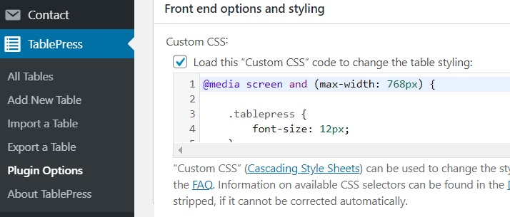
There is a simple change that can be made in the TablePress “Plugin Options” section.
You need to add the following into the relevant section on the admin side of TablePress.
@media screen and (max-width: 768px) {

.tablepress {

font-size: 12px;

}

}
You could of course make it 10px if you want it even smaller on a mobile.
I did have to reduce to down to 8px for a table with 5 columns, with numbers over 100,000 in the cells.
This can be overridden for individual tables, by using code specific to that table, such as:
This is the normal code to have that table (ID=4) set at 10px for desktop and mobile.
.tablepress-id-4 thead th,

.tablepress-id-4 tbody td {

font-size: 10px;

}
From the above, I worked out that it would be this, for that table (ID=4) but just for the mobile.
@media screen and (max-width: 768px) {

.tablepress-id-4 {

font-size: 10px;

}

}
I actually ended up with this code in that section:
@media screen and (max-width: 768px) {

.tablepress {

font-size: 12px;

}

.tablepress-id-4 {

font-size: 8px;

}

}
This sets all tables that show on a mobile at 12px font, but with table ID=4, as an exception using 8px.
WordPress “TablePress” plugin at: wordpress.org/plugins/tablepress
An extension is available for this plugin, for responsive tables at: tablepress.org/extensions/responsive-tables/
250.1 - 841,686
